Tuesday 17 July 2012

Assignment 3 Colour - complementary colours


The pictures for this assignment need to show a command for colour in photography and being able to find and use different colours in deliberate relationships. I need to produce four photos from each of the following

  • Colour harmony through complementary colours
  • Colour harmony through similar colours
  • Colour contrast through contrasting colours
  • Colour accent using any of the above
Here are my 4 pictures showing complementary colours
I have converted them to coloured pencil sketches using photoshop filters

VW Beetle


This first photo shows the cropped  front of this car next to a green hedge, the red is shown mainly in the outline of the car as the window and driver take up almost a third of the image, there is also some red in the drivers face. this shows red and green as complementary colours.


Poppy  field


Here we have a field of poppies mixed with green leaves and a few mauve thistles. I have also used red and green as complimentary colours as I have focused on the front poppies. Most of the picture is out of focus showing a muted mix of the colours in the background, this leaves a strong mix of red and green in the foreground


Snettisham sunset


In this sunset the complimentary colours are blue and orange, the course notes show that as orange is approximately twice as bright as blue the ideal proportions would be 1 orange to 2 blue. I think that this is not far off of that

Light and leaves


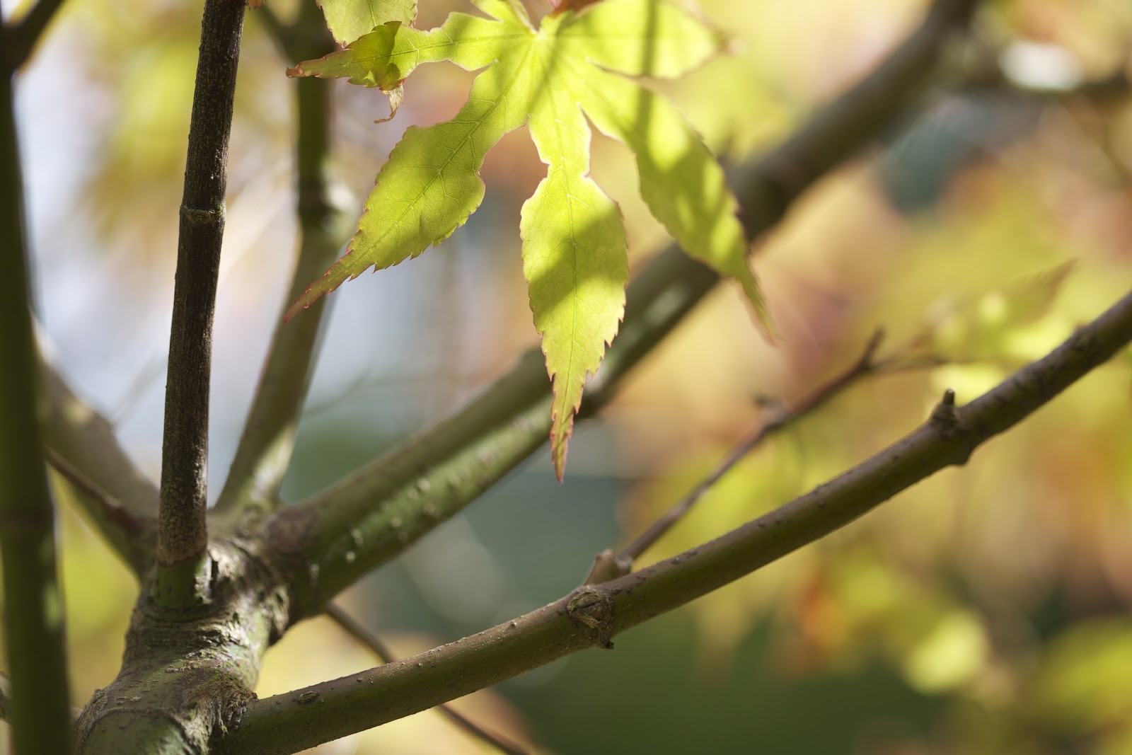
I was undecided wether to include this photo it shows an abstract effect looking up at the tree with the sun behind the leaf leaving patterns in it. I originally chose it to show red and green as complimentary colours, but when looking at it realised that the red is more of an orange red and the green a yellow green. Looking at how these colours are placed on the colour wheel would make them more contrasting colours


Hunstanton Cliffs


I took this photo to show the complimentary colours of blue and orange I liked the photo and the foreground interest but when I thought about it I decided that it would be better to crop it as this shows the colours off better and give better proportions.


Here is the cropped version showing a strip of blue at the top the reflection of this at the bottom in the sea with an orange strip running along the cliffs in the middle.

Colour harmony through similar colours

____________________________________________________

Here for the second part of the assignment are pictures showing colour harmony through similar colours


Duck on the Broads


In this otherwise grey picture there are 2 very distinct areas of blue and green both next to each other on the colour wheel, these are cool colours. The colours stand out really well in this otherwise dull muted picture.


Top of the Cliff


I took this  photo when walking along the top of the cliffs at Cromer, from the edge of  the cliffs you can see the grass before looking down to the sea. It also shows the colours blue and green in strips along the top and bottom with a strip or grey sea running in-between them.


Brancaster Beach sunset


The photo taken just after sunset at brancaster shows lots of lovely warm colours from the golden sands up to the clouds, showing lots of  light and different tones coming through them


Hunstanton


On the beach at Hunstanton it had been a lovely sunny afternoon with a bright blue sky showing white fluffy clouds, however when I turned around to walk back in the opposite direction the sky had changed into a darker stormy blue with sun rays trying to shine through creating a lovely effect. This along with the green on the rocks created a cool looking picture


------------------------------------------------------------------------------------


Colour contrast through contrasting colours

Red brick roof


Contrasting colours are very different from each other and spaced about a third of the way round the circle making them very eye catching. I was driving through this small village with very narrow lanes when I saw this cottage, luckily there were no cars behind me so I managed to pull over and take a quick photo. I found this cottage with its red tile roof and blue window and fascia to be very striking

Doors to the sea


This picture of the doors is in a lovely cafe in Cromer, they lead out onto a balcony. It shows 3 shades of blue, with blues from the doors sea and sky, contrasting with a smaller amount of red in the  flags

Rape field


My next contrasting picture shows blue and yellow. There is a strip of yellow rape along the bottom and then the blue sky broken up by the clouds. I used a polarising filter to bring the blue out in the sky and it has also made the clouds more prominent reducing the amount of blue that would otherwise be in the picture


Starburst flower


Purple and green are the contrasting colours in this picture, with the purple flowers and green stems. I have blurred the background a bit this gives a muted look and makes the purple flower and green at the foreground stand out


Petal carpet


This also has the colours  green and purple, with lots of green to the back of the picture and the bottom half shows all the purple flowers on the ground

Field edged by poppies


Golden yellow barley and red poppies are the contrasting colours in this photo. Although there is twice as much barley as red, The brightness of the red balances this up. I cropped in tightly to the poppies to show them in the foreground with the barley field behind

------------------------------------------------------------------------------------------------


Colour accent

This is when a small area of colour or accent is found within a larger background of another colour

Through the orchid


My first image is of an orchid, the background is all white with deeper shades in places where the petals fold and curve. In the middle of the flower the colour changes to a subtle yellow with smaller red markings. As I took the photo there was a small glimpse of blue from the sky coming through a gap in the petals and I thought this worked as an accent colour, although in my sketch this has not shown up very well. The tiny spots of red have come through brighter looking more like the accent colour so with this in mind I have cloned the blue out and added this other picture

Red post in the pier


It was a nice bright day when I took this photo of the iron work underneath Cromer pier. I was at first attracted by the shapes and angles in the metalwork, but I then spotted this 1 post towards the rear of the picture that was different from the rest being a rusty red colour. This stands out in the photo and I think it works well as an accent colour

Red lips


In this photo of Lilly she was looking into a mirror just before going to her prom. After applying some bright red lipstick, the rest of the photo is quite muted making her lips really stand out as the accent colour


The eye has it


Baby Sydney with a blurred blanket and peachy skin, her bright eye really stands out as an accent colour


Spot of yellow


In  this picture this yellow plain looks very tiny in the bright blue sky just showing up as a spot of colour

Wednesday 11 July 2012

Exercise 25 Colour into tones in black and white

I have made a still life arrangement that includes the colours red, yellow, green and blue. I found a blue bowl, cut a pineapple in half to show the yellow and used its spiky leaves for the green and placed some strawberries for the red.
I put all of these onto a board and then into a upturned box lid that was grey to show my grey card. Although the backdrop is also grey and shows this. I photographed this in colour and then went into lightroom to change to black/white and also used the preset filters for red, yellow green and blue.
Here are the results

 Coloured


Black + White


Red Filter


Yellow Filter


Blue Filter


Green Filter


Not sure if I should have used more solid shapes as the red and yellow pictures both showed up really light due to the large yellow area of the pineapple, the blue showed lots of detail in the yellow pineapple.
It was interesting to see how the filters affect the colours

William Eggleston


William Eggleston
BornJuly 27, 1939 (age 72)
Memphis, Tennessee
NationalityAmerican
FieldPhotography
InfluencedJuergen TellerAndreas Gursky,Sofia CoppolaGus van Sant,David Lynch
I have been looking at the work of William Eggleston, I found the information that I have read about him from http://en.wikipedia.org/wiki/William_Eggleston and have posted it below.
I was interested on how Eggleston viewed the Henri Cartier-Bresson book the decisive moment as a great book once he had understood it and it sank in.
 I tried looking for the book and found it on amazon for between £355 - £1500 more than I expected, but I have made
 a note to look at the work of Henri Cartier-Bresson at a later date. I found Eggleston to be 40th in a list of the
 most influential photographers  published by professional photographer they stated that Eggleston"s use of intense
 colour uneasy composition and disconcerting subject matter brought him to prominence and gained acceptance
 for colour photography as art. from a personal point of view I found  that the work of Eggleston is not a style 
of photography that I enjoy viewing as I like pictures with an arty feel to them and I found this quote:

 very apt The American artist Edward Ruscha said of Eggleston's work, "When you see a picture he’s taken,
 you’re stepping into some kind of jagged world that seems like Eggleston Worl[1]

William Eggleston (born July 27, 1939), is an American photographer. He is widely credited with increasing recognition
for color photography as a legitimate artistic medium to display in art galleries.
Early years


William Eggleston was born in Memphis, Tennessee and raised in Sumner, Mississippi. His father was an 
engineer and his mother was the daughter of a prominent local judge. As a boy, Eggleston was introverted;
 he enjoyed playing the piano, drawing, and working with electronics. From an early age, he was also drawn to
 visual media, and reportedly enjoyed buying postcards and cutting out pictures from magazines.
At the age of 15, Eggleston was sent to the Webb School, a boarding establishment. Eggleston later recalled few
 fond memories of the school, telling a reporter, "It had a kind of Spartan routine to 'build character'. I never knew
 what that was supposed to mean. It was so callous and dumb. It was the kind of place where it was considered
 effeminate to like music and painting." Eggleston was unusual among his peers in eschewing the traditional
 Southern male pursuits of hunting and sports, in favor of artistic pursuits and observation of the world. 
Nevertheless, Eggleston noted that he never felt like an outsider. "I never had the feeling that I didn't fit in,"
 he told a reporter, "But probably I didn't."[1]
Eggleston attended Vanderbilt University for a year, Delta State College for a semester, and the
 University of Mississippi (Ole Miss) for about five years, none of these experiences resulting in a college degree.
 However, it was during these university years that his interest in photography took root: a friend at Vanderbilt 
 gave Eggleston a Leica camera. Eggleston studied art at Ole Miss and was introduced to abstract expressionism
 by visiting painter, Tom Young.

[edit]Artistic development

Eggleston's early photographic efforts were inspired by the work of Swiss-born photographer Robert Frank,
 and by French photographer Henri Cartier-Bresson's book, The Decisive Moment.Eggleston later recalled that the
 book was "the first serious book I found, from many awful books...I didn't understand it a bit, and then it sank in,
 and I realized, my God, this is a great one.”[1]First photographing in black-and-white, Eggleston began 
 experimenting with color in 1965 and 1966 after being introduced to the medium by William Christenberry.
 Color transparency film became his dominant medium in the later 1960s. Eggleston's development as a 
 photographer seems to have taken place in relative isolation from other artists. In an interview, John Szarkowski
 of New York's Museum of Modern Art (MoMA) describes his first, 1969 encounter with the young Eggleston as
 being "absolutely out of the blue". After reviewing Eggleston's work (which he recalled as a suitcase full
 of "drugstore" color prints) Szarkowski prevailed upon the Photography Committee of MoMA to buy one of
 Eggleston's photographs.
In 1970, Eggleston's friend William Christenberry introduced him to Walter Hopps, director of Washington,
 D.C.'s Corcoran Gallery. Hopps later reported being "stunned" by Eggleston's work: "I had never seen
 anything like it."
Eggleston taught at Harvard in 1973 and 1974, and it was during these years that he discovered 
dye-transfer printing; he was examining the price list of a photographic lab in Chicago when he read about the
 process. As Eggleston later recalled: "It advertised 'from the cheapest to the ultimate print.' The ultimate print was
 a dye-transfer. I went straight up there to look and everything I saw was commercial work like pictures of cigarette
 packs or perfume bottles but the colour saturation and the quality of the ink was overwhelming. I couldn't wait to 
 see what a plain Eggleston picture would look like with the same process. Every photograph I subsequently
 printed with the process seemed fantastic and each one seemed better than the previous one." The dye-transfer
 process resulted in some of Eggleston's most striking and famous work, such as his 1973 photograph entitled
 The Red Ceiling, of which Eggleston said, "The Red Ceiling is so powerful, that in fact I've never seen it 
 reproduced on the page to my satisfaction. When you look at the dye it is like red blood that's wet on the wall....
 A little red is usually enough, but to work with an entire red surface was a challenge."
At Harvard, Eggleston prepared his first portfolio, entitled 14 Pictures (1974). Eggleston's work was featured in an
 exhibition at MoMA in 1976. The MoMA show is regarded as a watershed moment in the history of photography,
 by marking "the acceptance of colour photography by the highest validating institution" (in the words of
 Mark Holborn).
Around the time of his 1976 MoMA exhibition, Eggleston was introduced to Viva, the Andy Warhol "superstar",
 with whom he began a long relationship. During this period Eggleston became familiar with Andy Warhol's circle,
 a connection that may have helped foster Eggleston's idea of the "democratic camera", Mark Holborn suggests.
 Also in the 1970s Eggleston experimented with video, producing several hours of roughly edited footage Eggleston
 calls Stranded in Canton. Writer Richard Woodward, who has viewed the footage, likens it to a "demented home
 movie", mixing tender shots of his children at home with shots of drunken parties, public urination and a man
 biting off a chicken's head before a cheering crowd in New Orleans. Woodward suggests that the film is reflective
 of Eggleston's "fearless naturalism—a belief that by looking patiently at what others ignore or look away from, 
 interesting things can be seen."
Eggleston's published books and portfolios, include Los Alamos (actually completed in 1974, before the publication
 of the Guide) the massive Election Eve (1976; a portfolio of photographs taken around Plains, Georgia before that
 year's presidential election); The Morals of Vision (1978); Flowers (1978); Wedgwood Blue (1979); Seven (1979); 
Troubled Waters (1980); The Louisiana Project(1980); William Eggleston's Graceland (1984) The Democratic Forest
 (1989); Faulkner's Mississippi (1990), and Ancient and Modern (1992). Eggleston also worked with filmmakers, 
photographing the set of John Huston's film Annie (1982) and documenting the making of David Byrne's film
 True Stories (1986). He is the subject of Michael Almereyda's recent documentary portrait 
William Eggleston in the Real World (2005). In 2008, the Whitney Museum of American Art in New York
 co-organized with Haus der Kunst in Munich, the retrospective exhibition
 William Eggleston: Democratic Camera, Photographs and Video, 1961-2008

[edit]Eggleston's aesthetic

Eggleston's mature work is characterized by its ordinary subject-matter. As Eudora Welty noted in her introduction
 to The Democratic Forest, an Eggleston photograph might include "old tyres, Dr Pepper machines, discarded
 air-conditioners, vending machines, empty and dirty Coca-Cola bottles, torn posters, power poles and power wires,
 street barricades, one-way signs, detour signs, No Parking signs, parking meters and palm trees crowding the
 same curb."
Eudora Welty suggests that Eggleston sees the complexity and beauty of the mundane world: "The extraordinary,
 compelling, honest, beautiful and unsparing photographs all have to do with the quality of our lives in the ongoing 
world: they succeed in showing us the grain of the present, like the cross-section of a tree.... They focus on the
 mundane world. But no subject is fuller of implications than the mundane world!" Mark Holborn, in his introduction
 to Ancient and Modern writes about the dark undercurrent of these mundane scenes as viewed through
 Eggleston's lens: "[Eggleston's] subjects are, on the surface, the ordinary inhabitants and environs of suburban
 Memphis and Mississippi--friends, family, barbecues, back yards, a tricycle and the clutter of the mundane. 
The normality of these subjects is deceptive, for behind the images there is a sense of lurking danger.
" American artist Edward Ruscha said of Eggleston's work, "When you see a picture he’s taken, you’re stepping
 into some kind of jagged world that seems like Eggleston World.”[1]
According to Philip Gefter from Art & Auction, "It is worth noting that Stephen Shore and William Eggleston, 
pioneers of color photography in the early 1970s, borrowed, consciously or not, from the photorealists.
 Their photographic interpretation of the American vernacular—gas stations, diners, parking lots—is foretold in 
photorealist paintings that preceded their pictures."[2]

[edit]Notable publications

The earliest commercial use of Eggleston's art was on album covers for the Memphis group Big Star, with whom
 Eggleston recorded for the album Third/Sister Lovers and who used the famous Red Ceiling image on their album
 Radio City. Later records also had other Eggleston images, including the dolls on a Cadillac hood featured on the
 cover of the classic Alex Chilton album Like Flies on Sherbert. The Primal Scream album Give out But Don't 
Give Up features a cropped photograph of a neon confederate flag and a palm tree by Eggleston. In 1994, 
Eggleston allowed his long-time friend and fellow photographer Terry Manning to use two Eggleston photographs 
for the front and back covers of the CD release of Christopher Idylls, an album of ethereal acoustic guitar music
 produced by Manning and performed by another Eggleston friend, Gimmer Nicholson.
In 2006, a William Eggleston image was coincidentally used as both the cover to Primal Scream's single
 "Country Girl" and the paperback edition of Ali Smith's novel The Accidental. The same picture had already been
 used on the cover of Chuck Prophet's Age of Miracles album in 2004.
In 2001, William Eggleston's photograph "Memphis (1968)" was used as the cover of Jimmy Eat World's
 top-selling album Bleed American. Eggleston's photos also appear on Tanglewood Numbers by the Silver Jews,
 Joanna Newsom and the Ys Street Band by Joanna Newsom and Transference by Spoon.
Eggleston published a body of work in 2003 titled "Los Alamos" (Zurich: Scalo) which featured his photographs
 from 1966 to 1974. According to the introduction by Walter Hopps, the title for the book was derived from
 Eggleston's desire to have his own secret lab.


Here is some of his work that I enjoyed


[edit]